A Textural Kitchen Refresh
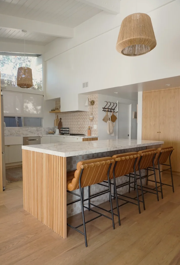
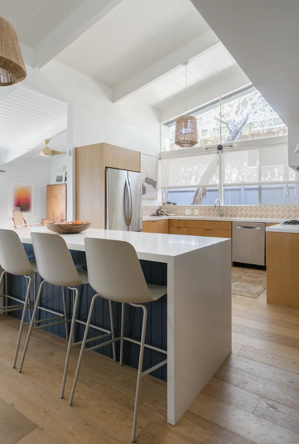
Join us today as we take a look at the beautiful work of artist Natalie Myers and her signature style known as "Scandifornian". By combining Nordic minimalism with elements of Japanese sensibility, the artist has been able to cultivate a unique and iconic style that blends these unique aesthetics with the chic laidback vibes of an indoor-outdoor Californian rancher. Incorporating natural materials and textures is essential when cultivating a layout that meshes natural outdoor colors with a modern palette.
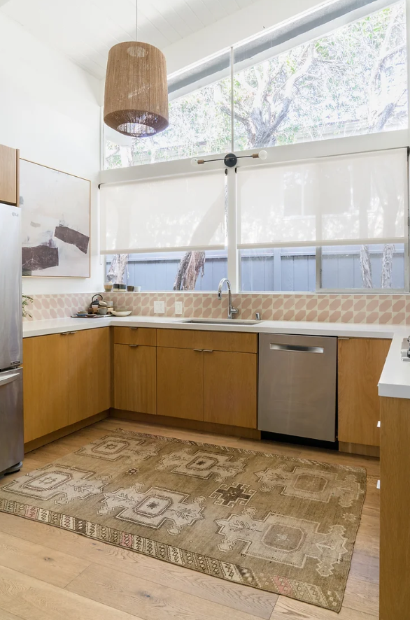
“all I wanted was flat front natural white oak cabinets and solid white countertop. I loved the clean and minimal look. I still do.”
Natalie’s meticulous approach to design has earned her the reputation of an innovative and emerging interior designer. What differentiates Natalie from the rest of the other designers is her multifaceted approach to the entire process. From ideation to implementation, Natalie takes a hands-on approach to every aspect of the design from furnishing and lighting to construction and curation. By overseeing the entire operation from start to finish, Natalie is able to inject her personality and prowess into every step of the journey without straying from the final objective: blending interior and exterior beauty.
In this article, we share some of Natalie’s secrets behind cultivating the perfect vibe for your space. Join us as we discuss the unique approach to texture that has made her one of the most sought after interior designers in this innovative new trend.
When she was designing her home 5 years ago, Natalie says she wanted something clean and minimal but not at the expense of sacrificing the uniqueness of her vision.
However, Natalie claims that two things happened over the next 5 years to encourage her to renovate. “The look started to become very popular. More and more recently renovated kitchens were sporting the same finishes and I felt like my kitchen was boring now.” She went on to say, “At the time I foolishly went with an unknown cabinetmaker because the pricing was too good to be true. Guess what folks, you get what you pay for…”
So true, Natalie. So true.
After accepting that the workmanship was not up to the high standards of her home, and in an attempt to recapture her uniqueness from the grips of kitchen conformity, Natalie endeavored to redesign her space using the artistic principles that epitomize her iconic and bold “Scandifornian” style.
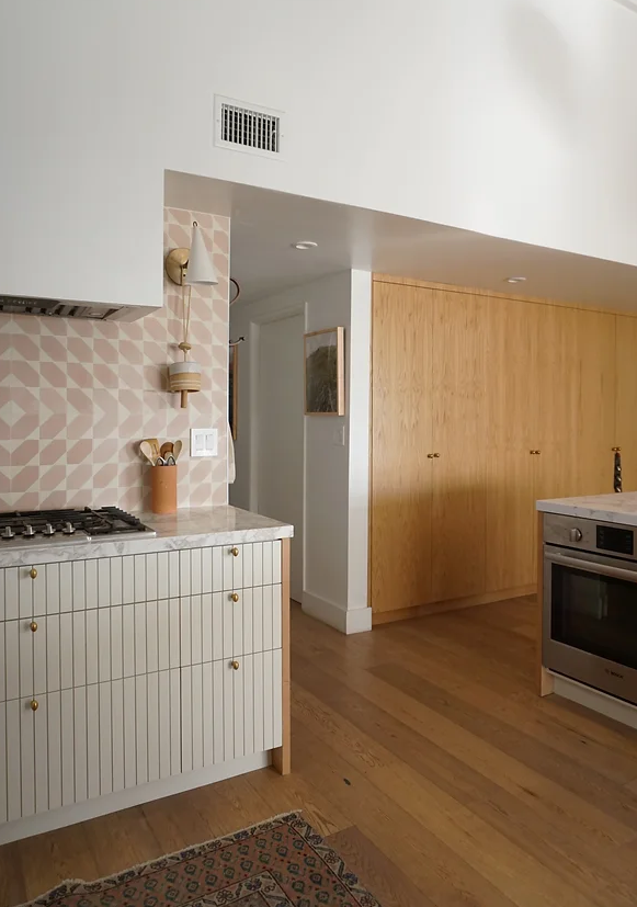
To make her kitchen the one-of-a-kind masterpiece she was dreaming of, she had to bring some serious light into the picture. Her previous cabinets showcased a rich maple woodgrain with classic appeal, but even this ultra-light shade of natural wood wasn’t light enough to reflect the sort of ambiance she was trying to achieve. After painting the cabinets off-white to match the bone cement tile, the room instantly became a lighter, more modern space simply by introducing a new level of uniformity to the room’s already rich palette of colors.
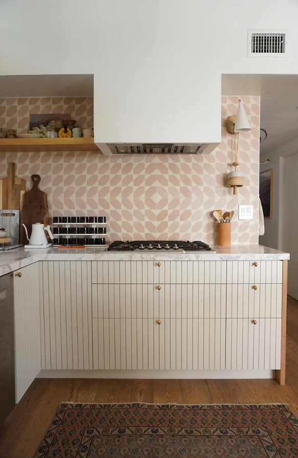
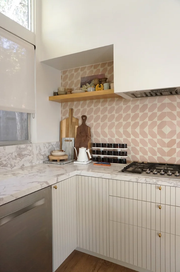
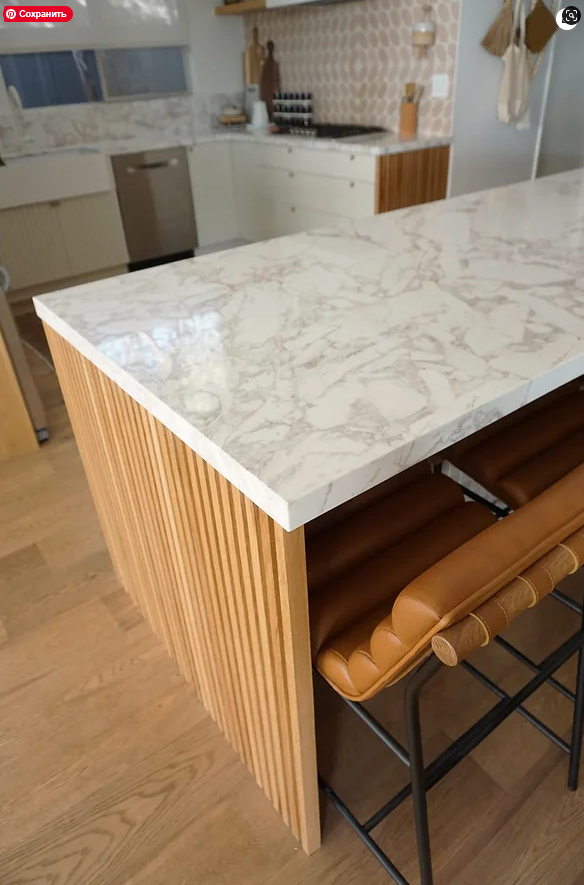
To remedy the remaining oak cabinets around the refrigerator, she added a series of slatted white oak side panels to the walls of the island and outside of the cabinet to prevent the last bit of woodgrain from clashing with her renewed, all-white palette.
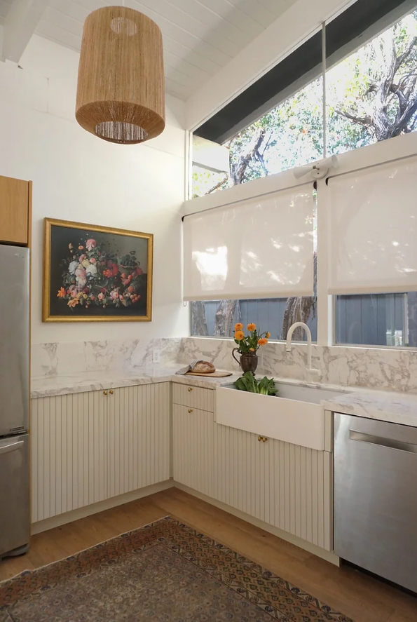
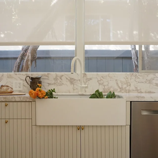
The backsplash also needed an update from both a chromatic and a textural standpoint. By finding a budget-friendly slab of Ovulato marble, Natalie was able to keep her costs down while adding a tremendous new element of character to the room. Minimalist designs are often seen as cold, rigid and uncompromising but this stunning layout possesses both warmth and wonder, delicately folded into every nook, cranny, and seam. Over time, the Ovulato’s iconic texture will oxidize and create a luxurious patina-like finish within its rich grain and marbling.
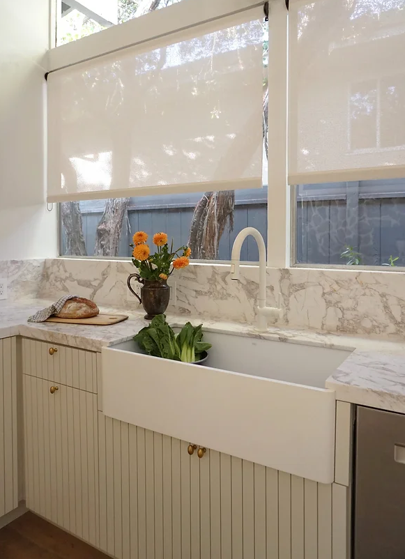
Natalie cemented herself as an iconic interior designer when she made the decision to include an all-new VIGO Farmhouse apron sink with a matte white Brizo faucet. Not only do the two products pair perfectly with each other but they’re also the quintessential addition to her monochromatic masterpiece. Natalie also explained that the calculated decision wasn’t just in regards to form but function. Using a seamless design like the one featured in this Farmhouse sink allows for easier cleanup with minimal residual water.
“I think changing to an apron front sink that is placed a few inches further away from the backsplash and jutting past the cabinet doors will help preserve the new finishes”.
“The Vigo is a clean lined contemporary example of such a sink style. I’m very much appreciating the focal point the white on white provides in the center of the kitchen.”
Thanks Natalie. We appreciate you, too. Thanks for including us in your stunning home and thanks for introducing the world to your impeccable ability to craft an unforgettable room. We can’t wait to see more of your Scandifornian style in the future.

