BEFORE AND AFTER: DIY KITCHEN RENOVATION
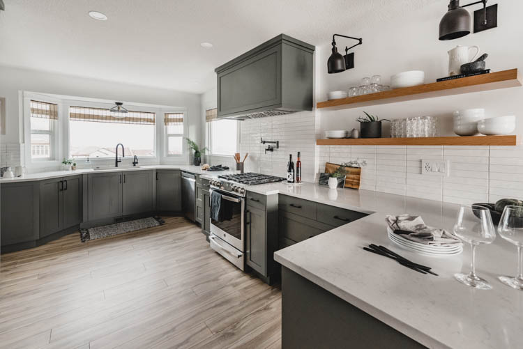
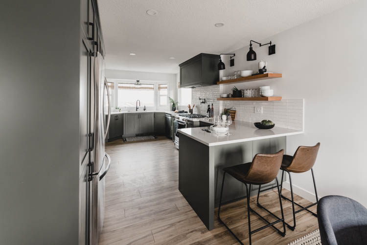
Colleen Pastor the blogger behind Lemon Thistle shared the reveal of her modern olive green kitchen
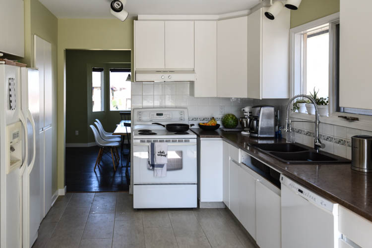
When homeowner Colleen and her husband bought their fixer-upper home, they had big plans to remodel it from top to bottom, room by room. They decided to start by remodeling the kitchen, taking it from outdated to fresh and modern. Proud of their transformation, Colleen shared the kitchen’s before and after designs.
“This kitchen was such a labor of love, but so rewarding to see [our visions] come to life. It’s not just the sweat that we put into the space (which we really did!) but also the reward of seeing the design and time that we spent dreaming about it coming to life,” said Colleen.
Instead of hiring professionals, Collen and her husband did a lot of the work themselves, staying up late into the night while their kids slept. Some of their major changeups included tearing down the wall between the kitchen and dining room. They moved the kitchen to the area where the dining room used to be and moved the dining room to the front of the house. This allowed them to have a much larger kitchen and easy access to the living room; a win win!
Kitchen Remodels “Before and After”
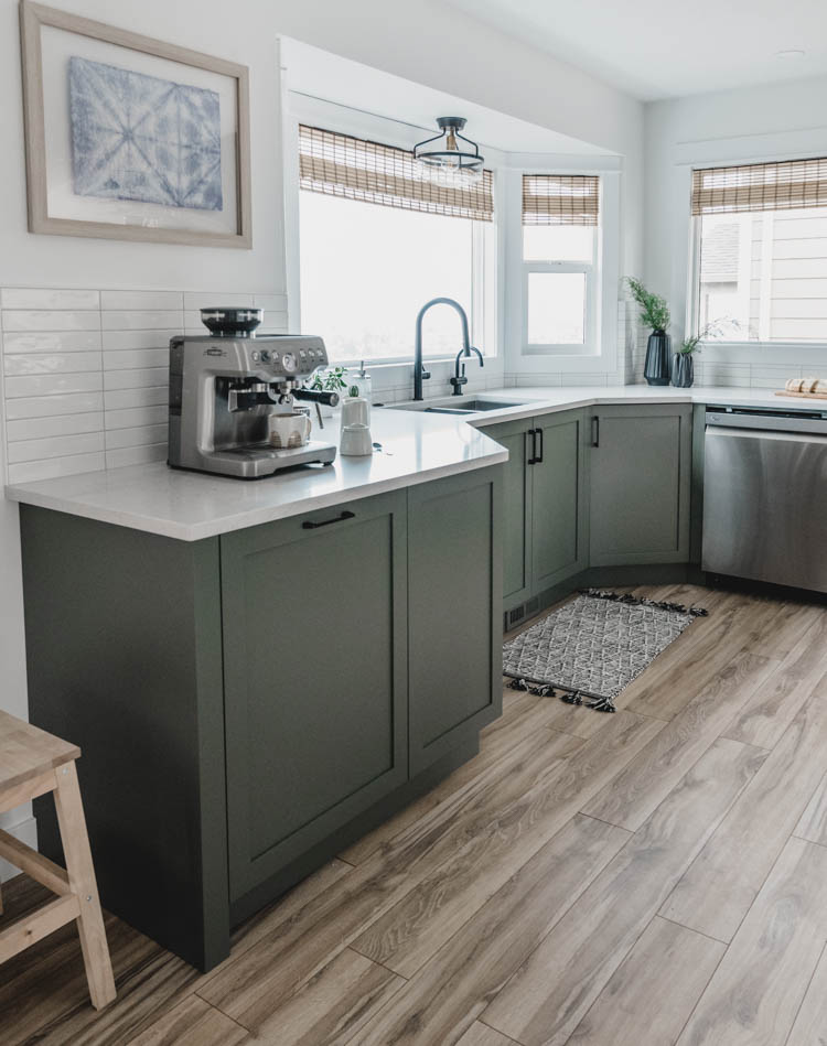
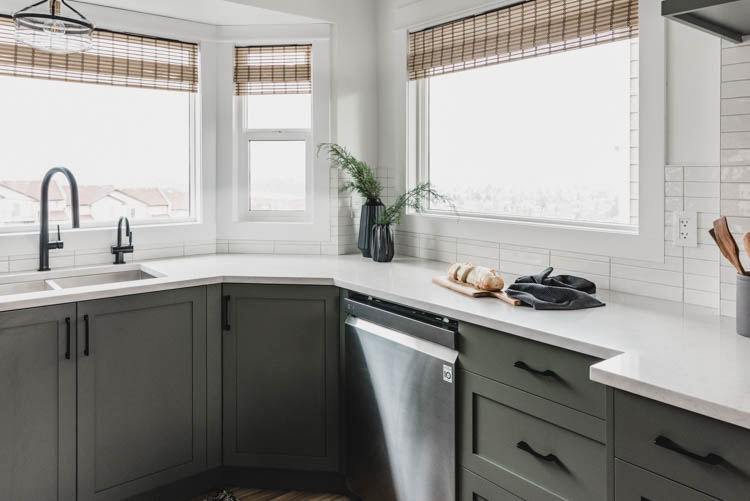
Even before they purchased their new home, Colleen and her husband had been mulling over the idea of doing navy cabinets. When they finally moved in, however, Colleen couldn’t pull the trigger on navy. In order to figure out what hue would be just right, she brought a pinboard full of green kitchens to her husband and was surprised to see that he loved it as much as she did. Green became their starting point and the couple started to make artistic decisions from there.
Countertops
The couple had always wanted solid surface countertops, but the budget and style of their previous home did not allow for it. In their new home, however, the kitchen was more of an open slate. With a healthier budget and a better layout, the new home’s kitchen permitted the quartz and non-directional pattern that Colleen and her husband love.
The Floors
Surfaces are always important aspects of a kitchen’s design. Although the old kitchen had an outdated tile style, Colleen was still afraid of the updated kitchen looking too modern. She knew the kitchen had a modern layout, so instead of going too contemporary, Colleen and her husband went for a more ethereal look. They went for wood-grained floorboard tiles with slightly roughened edges and uneven faces to add warmth to an otherwise ultra-modern layout. They chose the lightest grey grout possible to maintain a sleek and bright appearance and hired professionals to lay the foundation.
Kitchen Sink and Faucet
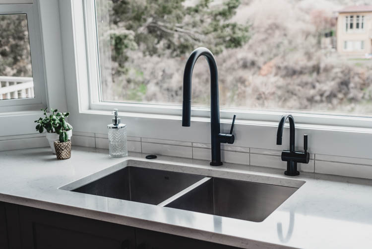
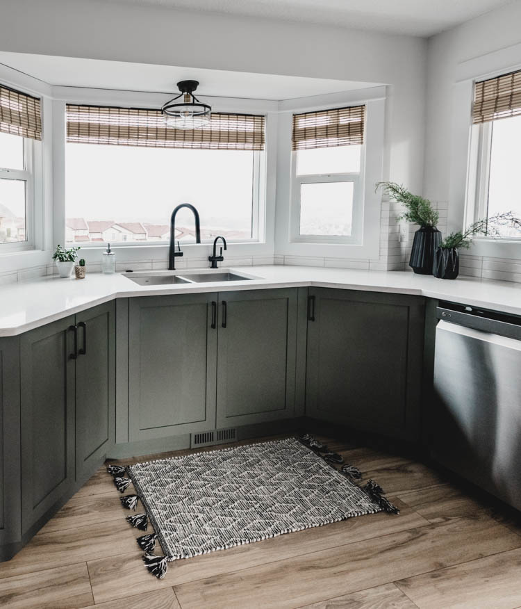
“The under mount stainless steel sink is from VIGO Industries and is an equal dual-basin 32″ sink. This sink, the Suffolk, has the nice square corners and drains much better than our last square sink that looked like this one. At 16-guage and 304- series, this stainless steel is of a higher quality than our previous sink but still comes with the sink grates, which is awesome because we cook so much that we’ll find a way to scratch and scuff any stainless sink – we have 4 kids tossing their dishes in there and all!” shared Colleen. Colleen was right; the grates provide a great safeguard against items tossed in the sink without care, all while preventing scratches and dents.
To go with the sink, Colleen and her husband chose the sleek and modern Greenwich Pull-Down Spray Kitchen Faucet, also a VIGO original. They chose a matte black finish to keep with the modern theme and were pleasantly surprised to see how well fingerprints and grease were expertly hidden.
On Useful Space
The new kitchen, while more spacious than what they were afforded with their previous layout, still did not allow Colleen and her husband to waste space. They understood that they needed to be creative with their use of space and think about the layout from every angle.
Instead of letting it be exposed, Colleen wanted the microwave to be hidden. She chose a model in which the doors open and then slide in so they can stay open while the microwave is in use.
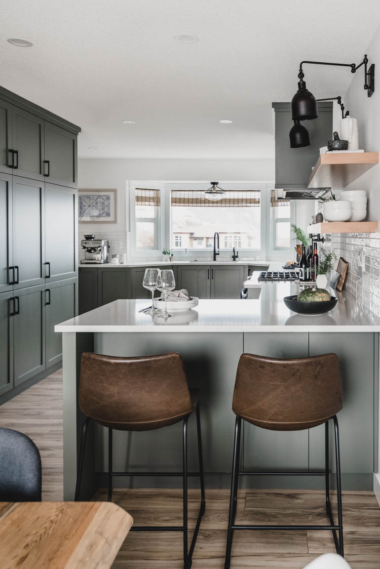
She also wanted a hidden drawer above the recycling/garbage pull out to store garbage bags, light bulbs and additional necessities. As for the peninsula, Colleen wanted it to not only be functional on top but also all around. They installed drawers and designed a layout that let them put a hidden cupboard in an otherwise hard-to-reach corner area. This couple decided to look at their space holistically and identified how they could best optimize it.
Open Shelving
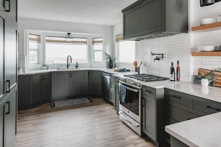
The couple loved having open shelving units in their previous kitchen, and knew they wanted to incorporate it again in their new space. They also wanted to place all of the windows on one side of the room to stream light through. Finally, Colleen and her husband chose to use a natural wood color to maintain consistency with the floor.
Lighting
Colleen’s biggest complaint about their last kitchen was that they didn’t properly light it. It wasn’t bright enough in general, and especially not during the evenings when they wanted to clean. In their new kitchen, however, the couple installed individualized spotlights throughout the space for bright light exactly where they want it. They also placed a lovely overhead light atop the sink, and installed arm lights over the open shelving.
All in all, this kitchen remodel came out beautifully. Colleen, her husband, and her family and thrilled with the end product and love living in their new kitchen.

